Written by Meghna Bhowmick
Since 2014, Living Room Storiez, a creative agency from Kolkata, has been turning ideas into visual stories. We’ve designed posters, branding campaigns, and creatives for brands, artists, and events.
Now, we’re stepping into a new chapter.
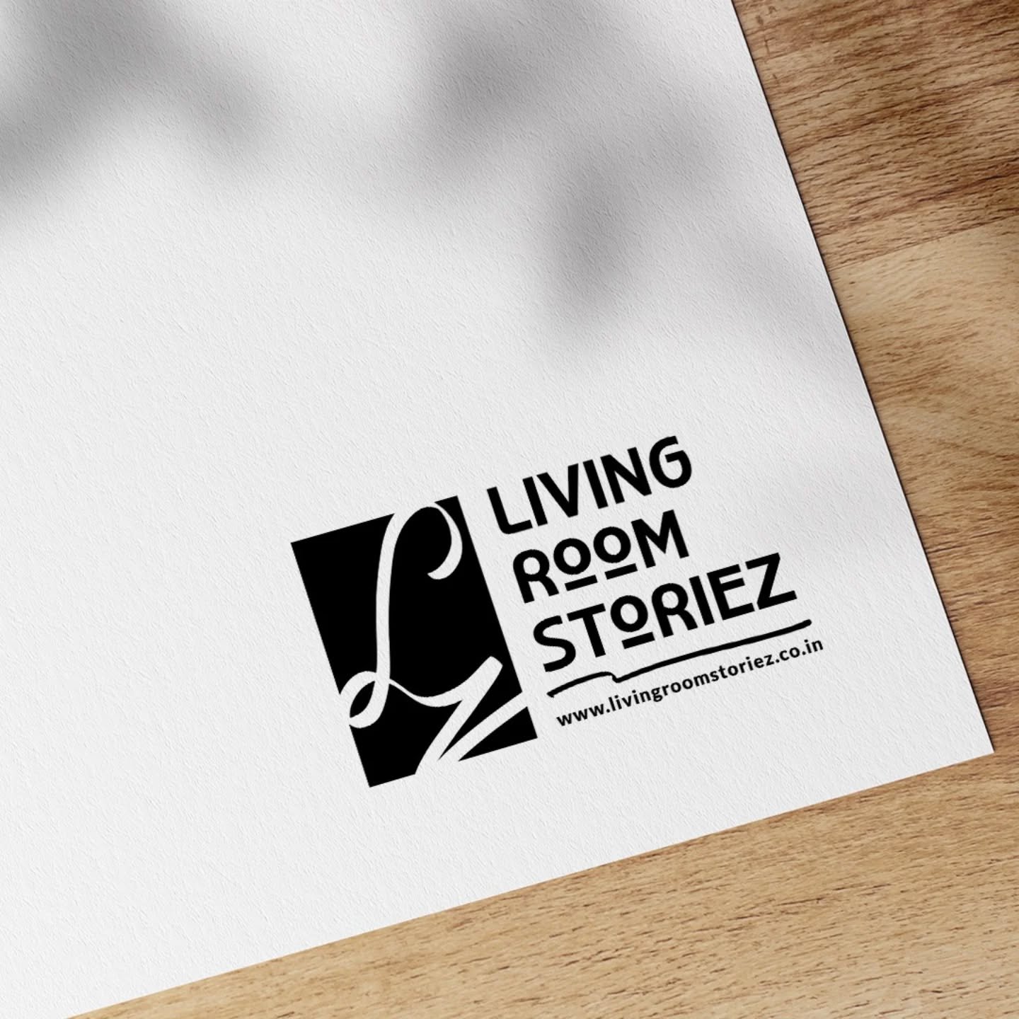
We’re proud to launch our redesigned logo. This is a fresh identity with deeper meaning, personal emotion, and a strong creative purpose.
A Look Back at Our Old Logo:
Our original logo was with us from the start. It reflected who we were back in 2014 young, passionate, and ready to create. Over the years, it became a symbol of our early journey and identity.
However, as we grew, we realized something. What once felt bold and fresh started to feel out of sync with our evolving work and the design world around us.
That’s when we knew, it was time for a change.
The Meaning Behind the New ‘L’:
At first glance, it’s just a letter. But for us, the new ‘L’ in Living Room Storiez holds something far deeper.
This ‘L’ is inspired by Latifa, my beloved Ammi (Maa). She was the silent strength behind every step I took, and every creative decision we made. The design of the letter comes from her own signature graceful, gentle, and full of life. It’s our way of keeping her spirit alive in everything we do.
Every time we sketch a logo, build a brand, or design a poster, this ‘L’ reminds us of where we come from. It stands not just for a name, but for the values she gave us love, resilience, humility, and warmth.
So, while this redesign marks a new beginning, it’s also a quiet salute to the woman who shaped our world. This is more than a logo. It’s a living memory. A personal story woven into our visual identity.
Why We Needed a Change?
While this logo has emotion at its heart, the change also comes from a need to grow. Here’s why the time felt right:
To Stay Modern:
Design is always moving forward. What looked fresh in 2014 may feel outdated now. Our previous logo started to feel like it belonged to an earlier phase of our journey.
We wanted a look that matched today’s clean, minimal style. One that speaks the language of today’s creative world.
To Follow Evolving Design Standards:
Design isn’t just about how something looks. It’s also about how it works across platforms like digital, print, mobile, and more.
The new logo is simpler, more versatile, and easier to adapt to different formats. It reflects the refined, thoughtful design standards we follow today.
To Reflect Our Growth:
Living Room Storiez has grown both in scale and in vision. We’ve worked with more clients, bigger campaigns, and a wider range of industries. The old logo no longer told that story. This new one feels aligned with who we are now and where we’re heading
To Keep Up With the Market:
The creative space is fast-paced and ever-changing. Clients expect modern design. Audiences look for connection. By refreshing our logo, we’re better equipped to meet those expectations and stay relevant in a competitive space.
To Be More Memorable:
A strong brand needs a symbol that sticks. Our old logo had charm, but it lacked clarity and consistency in some places. The new one is cleaner, more recognizable, and easier for people to remember—whether they see it on a screen, a poster, or a business card.
To Stand Out:
In a world full of creative agencies, standing out matters. This logo is uniquely ours. A mix of personal history and visual strength. It helps us carve out a distinct space in a busy industry without losing our soul.
To Reach New People:
Our audience is changing. We now connect with clients from different cities, sectors, and backgrounds. The new logo helps us speak to these new audiences while still staying true to our original story. It bridges who we were with who we’re becoming.
What We Faced During the Change?
At its core, rebranding is not just a design decision, but a meaningful journey. As we transitioned to our new logo, we faced a mix of technical challenges, creative decisions, and emotional moments. Here’s what the process looked like:
Technical Hurdles:
- Consequently, widespread updates were needed across all platforms — including social media, websites, presentations, and marketing materials.
- Ensuring consistency everywhere took time and careful planning.
- Next, we had to coordinate with our partners and platforms. As a result, the new identity was smoothly integrated.
Design Compatibility & Testing:
- The new logo had to work across different formats such as full logo, icon-only, black-and-white, and colored versions.
- We tested the design on different screen sizes, print mediums, and marketing assets.
- To enhance scalability, legibility, and balance across every layout, small but thoughtful tweaks were made.
Internal & Client Communication:
- First, our team had to fully understand the new logo. This meant learning its meaning, following its guidelines, and embracing its purpose.
- We also needed to prepare communication for our clients and collaborators so they could embrace the change.
- Therefore, our team remained aligned and well-informed throughout the process.
Emotional Letting Go:
- Over the years, our old logo carried countless memories. In fact, it symbolized our very first steps as a creative agency.
- Letting go of something so close to our heart wasn’t easy.
- But we reminded ourselves: growth means change, and this was a tribute to everything we’ve become.
What We Gained:
- As we went through the process, it led us to reflect deeply on who we are and where we’re going.
- As a result, we emerged stronger with a clearer identity, a renewed sense of purpose, and a brand story we’re truly proud of.
Looking Ahead with You:
This logo isn’t just for us, It’s for you. It is for our clients, friends, and creative community. You’ve trusted us with your stories since the beginning. As we move forward, we hope you’ll continue doing the same. After all, the future we envision is built on love, fueled by creativity, and shaped by stories that truly matter.

